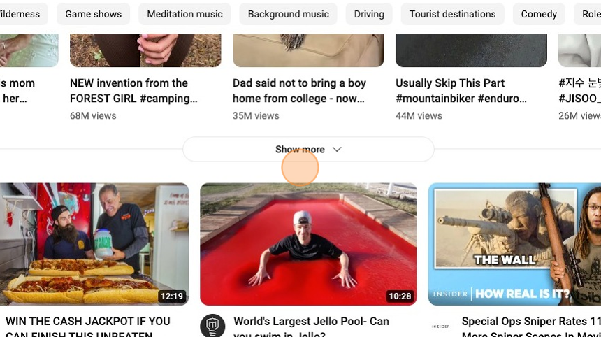
21 Essential Thumbnail Elements
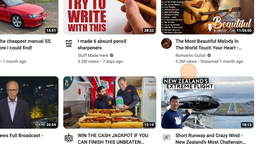
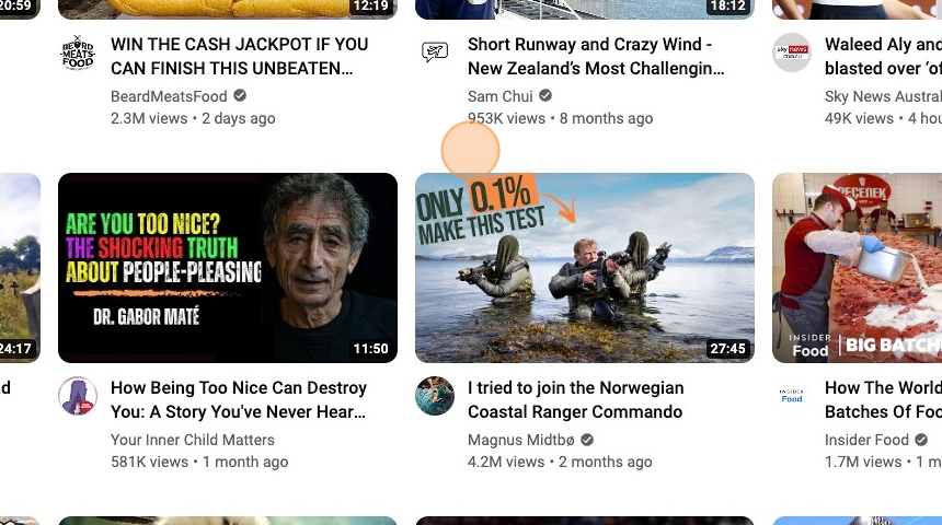
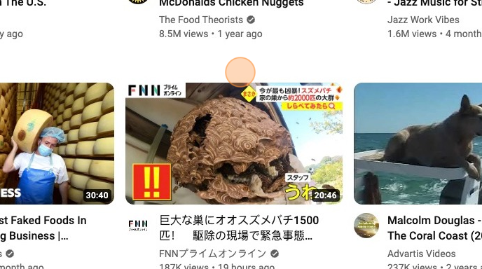
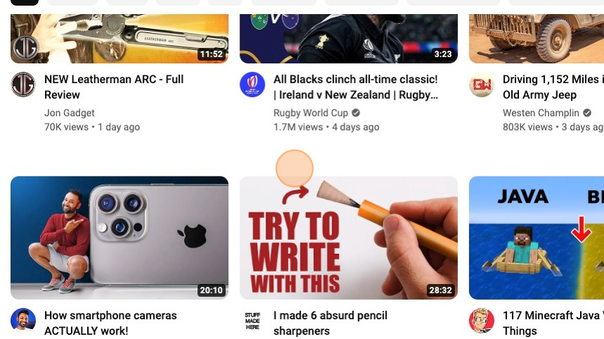
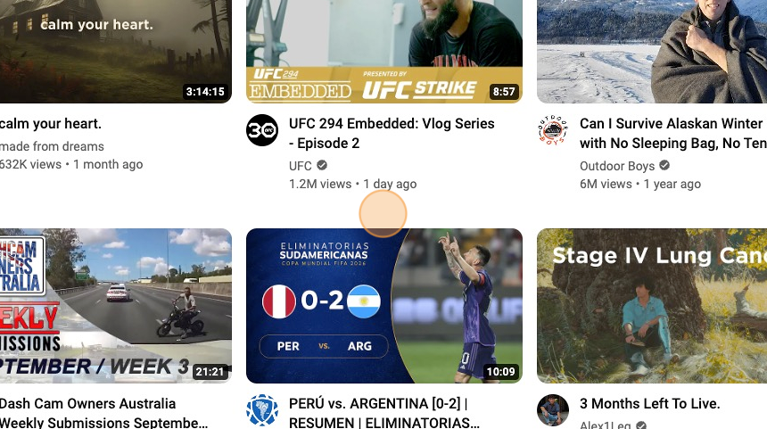
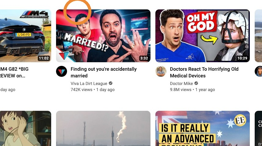
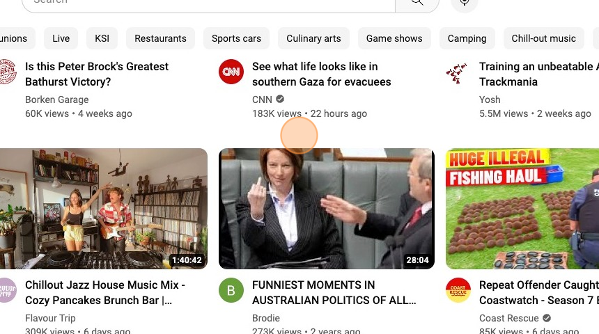
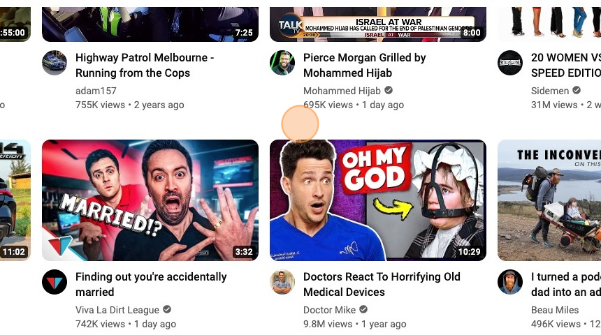
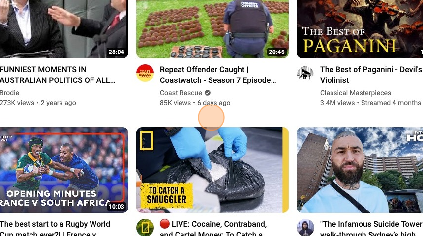
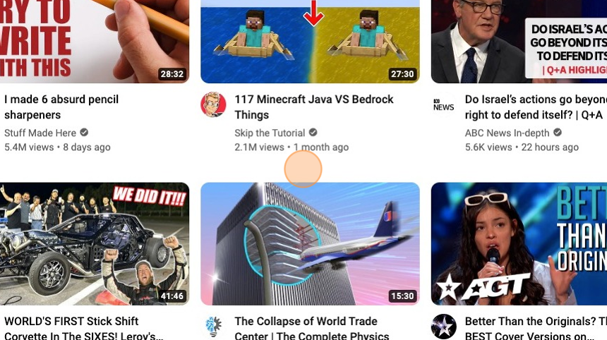
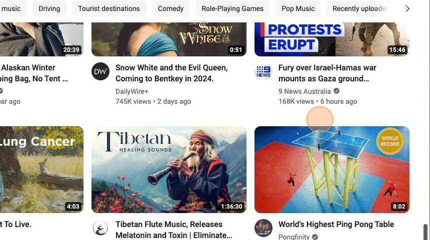
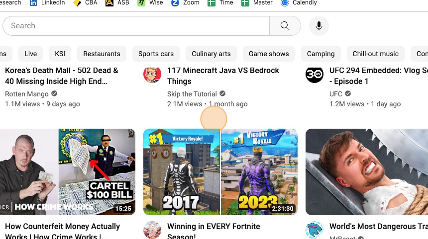
YouTube thumbnail elements are the visual attractant to your video content, enticing potential viewers to click. Common elements include action shots, custom artwork, eye-catching text, and vibrant colours. In this article, we take a closer look at what makes up these YouTube thumbnail elements.
1. Text Use
While the thumbnail image should be innovative and create interest when used in conjunction with great copy or text, you will maximise your Click Through Rates.
In the example below, you can see a great image, but without the text, you don’t get a full picture of what the video is about and will not be as compelled to click and watch the video.
2. Word Count
For thumbnails, you have limited space in which you can use copy that conveys a compelling reason to watch your video to the viewer. This is one reason to keep your word count low, but often less is more when creating intrigue and interest.
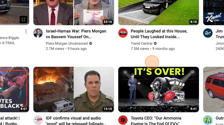
In the example below, you can see “It’s Over!” adds a level of intrigue and interest in the thumbnail that entices the viewer to learn more by watching the video.
3. Text Size
Font size is important when you have such a small real state on your thumbnails. Too big and your thumbnail can look tacky and too small it’s not able to be read easily at a glance.
The optimal size depends on your background image, the count of the words you have used and the ability for the copy to be easily read. With so much competition you will need to make your thumbnail copy not only compelling and intriguing but also easy to see and therefore read.
4. Text Colours
The colour of the text is also a factor when telling your thumbnail story. Consideration must be placed first on what colours work best and stand out on your selected background image or thumbnail frame.
Additionally, you will need to consider if you want to stick with your brand colours to give your overall branding consistency and branding recognition.
Tip: Text colours also carry various meanings and interpretations.
- Red, for example, is often associated with love and passion, but it can also signify danger.
- Blue represents calm and trust but can also convey sadness.
- Green symbolizes nature and growth, yet it can be linked to envy.
- Yellow denotes happiness and positivity but is also associated with caution.
- Purple often signifies royalty and creativity.
- Orange represents energy and enthusiasm.
- Black conveys elegance and mystery but can also represent darkness.
- White is associated with purity and innocence, while pink represents love and tenderness.
- Brown symbolizes earth and reliability.Keep in mind that the cultural and personal context can significantly affect the meaning of colours.
5. Text Background (None or on colour)
The main two reasons to use a background colour on the text used on your thumbnails are to provide contrast from your background image and to make the text pop more than it would without using a background colour.
In the case below, it is used to tie in with the plane’s colours, but a red background could have been used to help convey the danger message in which the video relates to a short and dangerous runway.
6. Text Positioning
Generally, the human eye is drawn to the top left of an image. This is believed to be culturally driven, at least in the West, as reading patterns dictate that people are accustomed to reading from left to right and from top to bottom. Therefore, the top-left corner is often the starting point for reading, and our eyes naturally gravitate there.
7. Language
60% of YouTube’s total video views originate from viewers who do not primarily speak English. This can be essential if you want viewers in a select geographical region.
8. Call to Action
A good call to action can be used more in YouTube video thumbnails than what you commonly see used.
While creating intrigue and getting users interested enough to click on your video thumbnail and watch your content can be employed, another message asking you to watch the video can also be compelling.
Tip: Simple, short, calls to action that could be used on a video thumbnail include;
- Click to Watch!
- Don’t Miss Out
- Join In!
- Discover Now
- See for Yourself
- Watch This!
- Click for Tips
- Learn More
- Explore Inside
- Get Started
- Catch the Action
- Watch the Full Story
- Try It Out
- Exclusive Peek
- Tap to Play
- Unlock Secrets
- Get Inspired
- Start Here
- Stay Tuned
- Click for Fun
- Get the Scoop
- Find Answers
- Join the Conversation
- Experience Now
- Swipe Up to View
- See the Results
- Click for a Surprise
- Quick Look
- Take a Look
- Learn Something New
Remember that an effective call to action on a video thumbnail should be concise and encourage viewers to engage with your content. It should also match the content and context of the video.
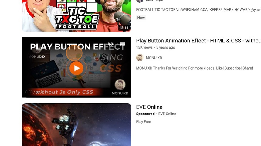
9. Play Button
Another often underused thumbnail trick is to add a button asking the viewer to click to play or using a simple play button. This simple trick can be enough to gain a click in a sea of video thumbnails.
Tip: Certainly, here are some short and engaging text examples to put on a video play button:
- “Play Now”
- “Watch”
- “Start”
- “Go”
- “Begin”
- “Press Play”
- “Play Video”
- “Enjoy”
- “See More”
- “Press Here”
- “View Now”
- “Let’s Watch”
- “Get Started”
- “Tap to Play”
- “Click to Watch”
- “Experience”
- “Start Now”
- “Play It”
- “Discover”
- “Engage”
These short texts can be placed on the video play button to prompt users to click and start watching the video. They are concise and direct, encouraging viewers to engage with the content.
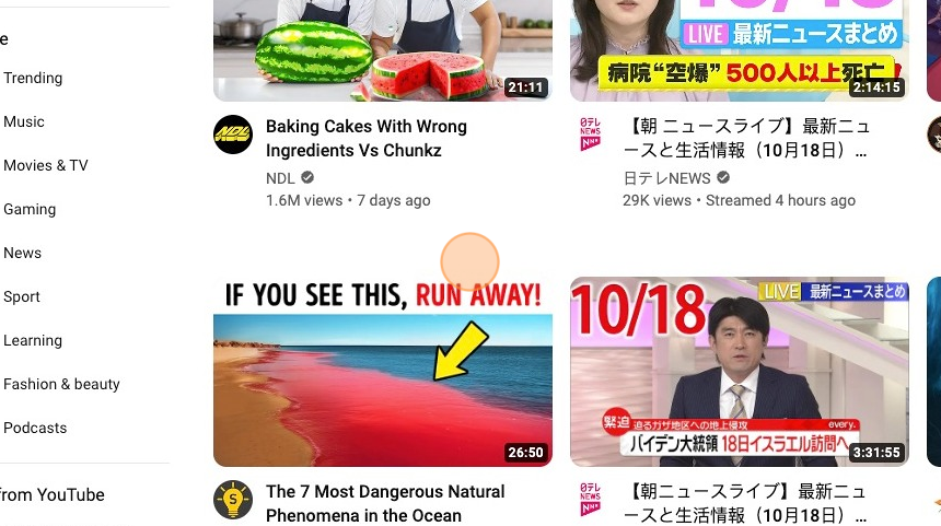
10. Arrows
This is a very effective way of highlighting exactly what you want the viewer to focus on within your thumbly thumbnail.
Arrows in thumbnails can indicate to a viewer that a particular area of the image is essential and effectively highlight calls to action, buttons or text on the thumbnail.
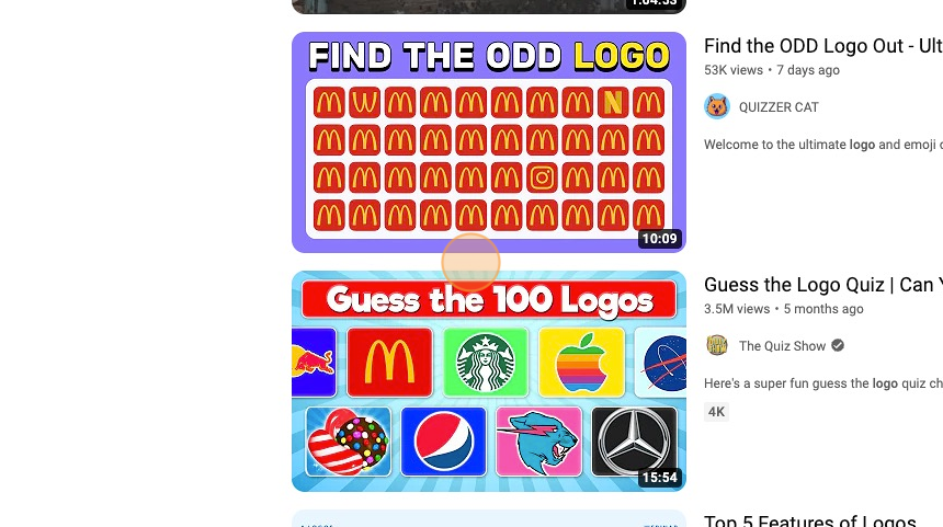
11. Logo
When you are a brand or trying to build a brand, a logo is a great way to get noticed and remain noticed, as the logo helps the viewer identify you more readily.
Tip: A cool logo can make people really like a brand because it’s something they remember and trust.
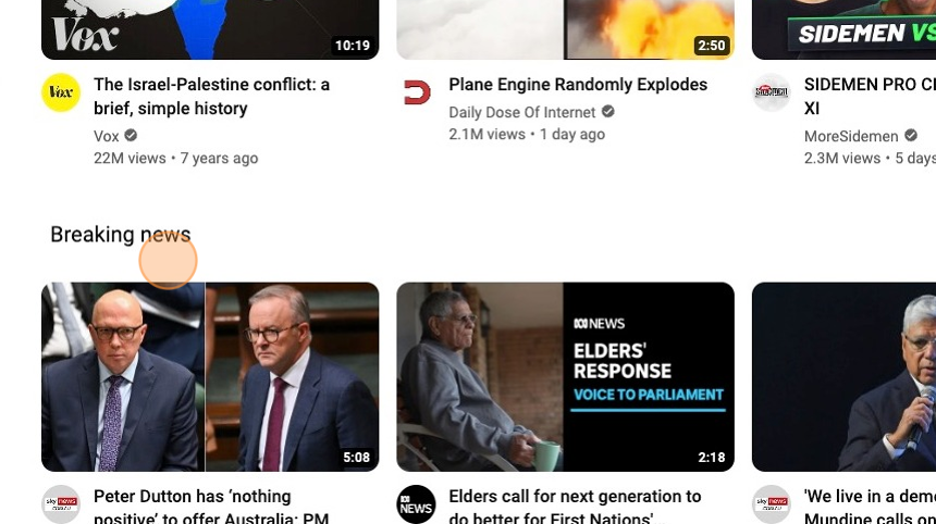
12. Side by Side (2 or more images split)
Often used as a before and after image, a two-frame side-by-side thumbnail can effectively tell a compelling story about what your video is about.
In this political example below, you can see two opposing government members telling a part of the start of what you can expect in the video.
13. Split Image to Block
Another practical side-by-side effect is to split the thumbnail with an image on one side and text on the other. This can be highly effective as you get the best of both worlds: a highly compelling image with a more formal or informative copy to read.
14. Face Emotion
Facial expression is something we can all instinctively interpret. Depending on the expression, this can help portray trust or intrigue, leading to a higher video CTR.
Tip: Facial expressions are essential for conveying emotions and non-verbal communication. Here’s a list of some common facial expressions and the emotions they often represent:
- Smile: Happiness, friendliness.
- Laugh: Amusement, joy.
- Frown: Displeasure, sadness.
- Tears: Sadness, grief.
- Grin: Satisfaction, approval.
- Surprise: Shock, astonishment.
- Angry Face: Anger, irritation.
- Pout: Discontent, sulking.
- Raised Eyebrows: Surprise, curiosity.
- Eyebrow Furrow: Confusion, concern.
- Eye Roll: Sarcasm, annoyance.
- Blushing: Embarrassment, shyness.
- Lip Bite: Nervousness, tension.
- Squinting: Suspicion, scrutiny.
- Wide-Eyed: Fear, astonishment.
- Wink: Playfulness, flirtation.
- Tongue Out: Playfulness, silliness.
- Neutral Face: Lack of emotion, or bored.
- Smirk: Sarcasm, self-satisfaction.
- Sigh: Exasperation, relief.
These expressions can vary in intensity and may combine to convey more complex emotions. People use facial expressions in everyday interactions to communicate their feelings and reactions.
15. Gestures
Gestures are non-verbal forms of communication that can convey various meanings depending on cultural context.
Tip: Here’s a list of some common gestures and their typical meanings, but keep in mind that interpretations may vary between cultures:
- Thumbs Up: Approval, agreement.
- Thumbs Down: Disapproval, disagreement.
- Peace Sign (V-Sign): Victory, peace, or a symbol of “peace and love.”
- OK Sign (Circle with thumb and forefinger): It can mean “okay” or “all is well” in many cultures.
- Pointing Finger: To indicate or draw attention to something.
- High-Five: Celebration, congratulation.
- Fist Bump: Friendly greeting or agreement.
- Clapping Hands: Applause, appreciation.
- Waving Hand: Greeting, saying hello or goodbye.
- Blowing a Kiss: Sending affection or love.
- Crossed Fingers: Hope or wishing for good luck.
- Nodding Head: Agreement, approval.
- Shaking Head (Side to Side): Disagreement or negation.
- Head Tilt: Interest, curiosity.
- Facepalm: Frustration, embarrassment.
- Handshake: Greeting, agreement, or sealing a deal.
- Throat Slitting Gesture: Threat or a sign of violence (use with caution).
- Middle Finger: An offensive gesture implying disrespect or anger.
- Hand on Heart: Pledge of honesty, sincerity, or patriotism.
- Raised Eyebrows: Surprise, disbelief.
- Hand on Chin (Thinking Pose): Deep in thought or contemplation.
- Shushing Gesture (Index Finger on Lips): Quiet or silence.
- Tapping One’s Watch: Impatience or a signal to hurry up.
- Salute: Respect, often used in a military context.
- Namaste (Palms together, fingers pointing upwards): A respectful and peaceful greeting in Indian culture.
- Throat Clearing: Getting someone’s attention or signaling discomfort.
- Two-Finger Whistle: Calling someone’s attention.
- Foot Tapping: Impatience or nervousness.
- Hand to Ear (Call Me): Request for a phone call.
Remember that the interpretation of gestures can vary widely depending on cultural norms and individual contexts. It’s important to be aware of cultural differences when using or responding to gestures.
16. White line around the face or body + Background added.
By removing the background and putting a borderline around a face or an item, you can accentuate the part of the image that you want to draw the most attention to in your thumbnail.
17. None-Face
While faces can be a great way to create an emotional response or connection with the viewer, a simple image that will arouse someone’s curiosity or interest can help convince the user to click on your thumbnail.
18. Graphic or Illustration
When appropriate, a well-made illustration can effectively stand out from the crowd regarding YouTube thumbnails and create the desired interest levels for viewers.
In most genres of videos, these are not used and can be an excellent way to cut through to your audience.
19. Cartoon Style Thumbnails
Once again, a cartoon-style thumbnail could be compelling depending on the use case and the message you are trying to convey.
20. Gaming Screens Shot
Gaming videos are watched on YouTube, so it makes sense that you will regularly see great thumbnails showing a frame shot from a popular game.
These gaming thumbnails work best when there is an interesting point that will resonate with the game player or fan that they can quickly understand and relate to the game.
Tip: Here’s a list of some common gestures and their typical meanings, but keep in mind that interpretations may vary between cultures:
- Thumbs Up: Approval, agreement.
- Thumbs Down: Disapproval, disagreement.
- Peace Sign (V-Sign): Victory, peace, or a symbol of “peace and love.”
- OK Sign (Circle with thumb and forefinger): It can mean “okay” or “all is well” in many cultures.
- Pointing Finger: To indicate or draw attention to something.
- High-Five: Celebration, congratulation.
- Fist Bump: Friendly greeting or agreement.
- Clapping Hands: Applause, appreciation.
- Waving Hand: Greeting, saying hello or goodbye.
- Blowing a Kiss: Sending affection or love.
- Crossed Fingers: Hope or wishing for good luck.
- Nodding Head: Agreement, approval.
- Shaking Head (Side to Side): Disagreement or negation.
- Head Tilt: Interest, curiosity.
- Facepalm: Frustration, embarrassment.
- Handshake: Greeting, agreement, or sealing a deal.
- Throat Slitting Gesture: Threat or a sign of violence (use with caution).
- Middle Finger: An offensive gesture implying disrespect or anger.
- Hand on Heart: Pledge of honesty, sincerity, or patriotism.
- Raised Eyebrows: Surprise, disbelief.
- Hand on Chin (Thinking Pose): Deep in thought or contemplation.
- Shushing Gesture (Index Finger on Lips): Quiet or silence.
- Tapping One’s Watch: Impatience or a signal to hurry up.
- Salute: Respect, often used in a military context.
- Namaste (Palms together, fingers pointing upwards): A respectful and peaceful greeting in Indian culture.
- Throat Clearing: Getting someone’s attention or signaling discomfort.
- Two-Finger Whistle: Calling someone’s attention.
- Foot Tapping: Impatience or nervousness.
- Hand to Ear (Call Me): Request for a phone call.
Remember that the interpretation of gestures can vary widely depending on cultural norms and individual contexts. It’s important to be aware of cultural differences when using or responding to gestures.
Tip: Gaming thumbnails on YouTube come in various styles, but they all aim to capture the viewer’s attention and convey the essence of the game being played. Here’s a list of some common types of gaming thumbnails:
- Action Shots: Showcasing intense moments from the game, such as battles or explosions.
- Character Close-Ups: Highlighting the main characters’ faces or expressions.
- Game Logo Integration: Blending the game’s logo or title into the thumbnail design.
- Custom Artwork: Using original artwork or fan art related to the game.
- Screenshots: Using in-game screenshots to represent the gameplay.
- Facecam: Featuring the YouTuber’s face reacting to the game in a small corner.
- Comparison or Before/After: Showing changes or improvements in a game over time.
- Text and Emojis: Adding text or emojis to convey excitement or information.
- Thumbnail Collages: Combining multiple images or elements to tell a story.
- Progression Bars: Indicating in-game progress or milestones.
- Episode Numbers: Displaying the episode number in a series.
- Colorful Borders: Using vibrant and eye-catching borders to frame the thumbnail.
- Countdowns: Showing a timer or countdown for an upcoming release or event.
- Game Developer Logos: Including logos of the game’s developer or publisher.
- Gameplay Elements: Incorporating relevant in-game items, icons, or HUD elements.
- Textured Backgrounds: Using textured or stylized backgrounds to set the mood.
- Thumbnail Themes: Consistently using a particular style or theme for all gaming videos.
- Clickbait Elements: While not recommended, some creators use exaggerated or misleading elements to entice clicks.
The most effective gaming thumbnails are visually appealing, represent the content accurately, and are consistent with your channel’s branding. You could also think about the gamers triggers that will get them to connect with your thumbnail and corresponding video.
21. Stand Alone Image
When the image alone works, it just works, and you don’t need anything else to make a click on your thumbnail more than compelling.
This is another good example of how sometimes you can make your YouTube video thumbnail stand out from the crowd without going over the top. Sometimes, less is more!


